

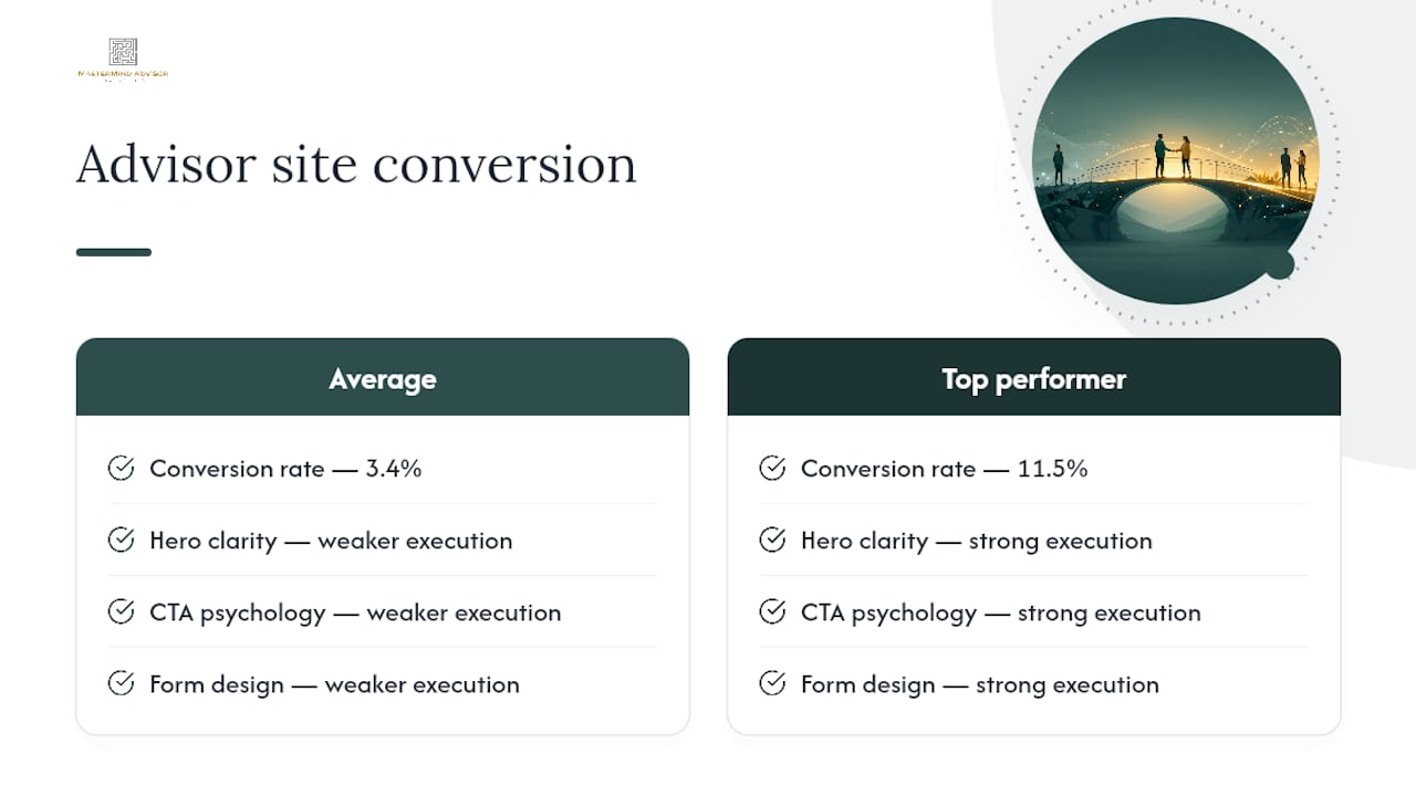
Fix three things first: hero messaging that names your ideal client and their outcome, one primary call-to-action paired with an expectation line that kills meeting anxiety, and a short intake form instead of a financial questionnaire. Advisor landing pages convert at 3.4% on average, while top performers hit 11.5% — the gap comes almost entirely from these three levers. Run a headline test against a short-form, softer-CTA variant for 30 days before touching anything else on the site.
TL;DR:
- Testing a niche-specific headline against a generic one can increase conversion rates by 20 to 40 percent within the first month.
- Using softer, low-pressure CTAs with clear expectations can significantly reduce booking anxiety and improve meeting attendance.
- Shortening intake forms to only ask for name, email, and phone boosts initial conversions by roughly 40 percent compared to long forms.
- Highlighting specific client outcomes and explicit fiduciary status on websites has more influence on trust than credentials alone.
- Mobile conversion rates are about half of desktop due to friction, so optimize mobile forms, click-to-call buttons, and fast load times for better results.
Table of Contents
- What Actually Drives Advisor Website Conversion
- How Should Your Primary CTA Read?
- Which Forms and Offers Actually Convert?
- What Trust Signals Actually Move the Needle?
- Mobile vs. Desktop: Where People Actually Convert
- How Do You Measure Advisor Website Conversion?
- Does a Process Page Reduce No-Shows?
- What Should You Fix First, and When?
- The Numbers Behind These Recommendations
- Why Your Website Deserves the Same Discipline as Your Portfolio Process
- How Mastermind Advisor Marketing Turns These Fixes Into a System
- Sources
- FAQ
What Actually Drives Advisor Website Conversion
The single biggest lever behind advisor website conversion isn't design polish or a bigger logo. It's whether a visitor can answer three questions inside five seconds of landing on your homepage: who do you help, what specific outcome do you deliver, and what happens if they click the button. Miss any one of those and the visitor bounces, no matter how clean your site looks.
Most advisor sites fail the specificity test. They lead with "comprehensive wealth management for individuals and families," which describes roughly 40,000 RIAs in the United States and commits to nothing. Generic messaging that doesn't address a visitor's actual situation is the most common reason advisor sites stall on conversion — not slow load times, not weak SEO, not a dated color scheme. A visitor who runs a $2 million dental practice and needs succession planning will skip past "helping families achieve their financial goals" every time, because it could describe anyone.
Here's a fill-in-the-blank template that forces specificity into your hero section:
"We help [audience] [achieve specific outcome] through [your primary differentiator]."
Examples that pass the five-second test: "We help retiring physicians turn a 30-year practice into a tax-efficient retirement income stream." Or: "We help tech employees with concentrated stock positions build a diversification plan before their next vesting date." Notice neither sentence mentions credentials, AUM, or "holistic planning." Both name a person, a problem, and an implied first step.
Once you've drafted two or three hero variants, test them against each other rather than guessing which sounds best in a meeting. Three setups worth running in your first month:
- Headline swap, same page: Run your current generic headline against a niche-specific version using a tool like Google Optimize alternative or your CMS's native A/B feature, tracking clicks to the primary CTA.
- Audience-split landing pages: If you serve two distinct segments (say, pre-retirees and business owners), build two landing pages with matching ad campaigns and compare form completion rates.
- Subhead specificity test: Keep the headline fixed and test a vague subhead against one that names a concrete deliverable, like "a written retirement income plan in your first 45 days."
Headline tests alone can produce a 20 to 40 percent lift in conversion, which makes this the cheapest, highest-leverage fix on the list. You don't need a developer for any of this. You need a Google Doc with three headline options and two weeks of traffic.
How Should Your Primary CTA Read?
"Book a Call" is the most common CTA on advisor websites, and it's also one of the biggest sources of unnecessary friction. Scheduling a call with a stranger about your finances triggers real anxiety, especially for a prospect who has never sat across from an advisor before. That hesitation isn't laziness. It's a rational response to an ambiguous, high-stakes-sounding request.
Softening CTA language and adding an expectation statement reduces booking anxiety and increases both clicks and meeting attendance. Instead of "Book a Call," try language that reframes the ask as low-stakes and exploratory: "Start a Conversation," "See If We're a Fit," or "Get Your Questions Answered." The action is identical. The perceived risk drops.
Visual placement matters as much as the wording. A page with three competing buttons ("Book a Call," "Learn More," "Download Our Guide," all in different colors) forces the visitor to make a decision the page should be making for them. Stick to one primary CTA color used consistently across every page, and place it near a photo of the advisor who will actually take the call. A face reduces the "who am I even talking to" hesitation that kills a lot of clicks before they happen.
Here are six microcopy variants worth testing, each paired with a subtext line that does the real anxiety-reduction work:
- "Start a Conversation" — subtext: "15 minutes, no pressure, no preparation required."
- "See If We're a Fit" — subtext: "A short call to see if our approach matches your goals."
- "Get Your Questions Answered" — subtext: "No obligation. Bring whatever questions you have."
- "Schedule Your Intro Call" — subtext: "20 minutes, by phone or video, your choice."
- "Talk to an Advisor" — subtext: "Same-week availability. No financial documents needed."
- "Request a Plan Review" — subtext: "30 minutes. We'll tell you what we see, whether you hire us or not."
Pro Tip: Put the subtext directly under the button in a smaller, muted font rather than burying it in a paragraph above. Visitors scan for the button first and read the fine print only if it's within eye range of where they're already looking.
Which Forms and Offers Actually Convert?
Not every visitor is ready for a consultation, and treating them like they are costs you leads. A first-time visitor who found you through a blog post about required minimum distributions isn't in the same buying stage as someone who searched "fee-only advisor near me" and landed directly on your contact page. Match the offer to the intent.
- High-intent offers for warm traffic. A "Book an Intro Call" or "Request a Plan Review" CTA belongs on pages with clear buying signals: your services page, pricing page, or anywhere traffic arrives from a branded search. These visitors already know they want a conversation.
- Low-intent lead magnets for cold traffic. Blog readers and social media visitors respond better to a specific download, such as a retirement income checklist or a stock option tax guide, than to a consultation request. Well-built lead magnet ideas can outperform generic newsletter sign-ups by a wide margin because they solve one narrow problem instead of promising general value.
- A middle-tier offer for the undecided. A short educational webinar or a "financial checkup" quiz gives hesitant visitors a lower-commitment step before a live call, and it segments your list by topic interest for later follow-up.
Whatever the offer, keep the form itself short. Short forms asking only for name, email, and phone convert roughly 40 percent better than long forms that request income, asset ranges, or account details up front. Every additional field is a reason to abandon. Save the qualifying questions for the call itself, or collect them through progressive profiling: a follow-up email sequence that asks one or two additional questions over time rather than all at once on the first form.
If your CRM supports it, tag leads by the offer they engaged with and trigger a follow-up sequence that matches the topic they raised, whether it's automated email nurturing or a personal call from the advisor. A form is only the first half of the conversion. The follow-up cadence is the second half, and it's the half most firms neglect.
What Trust Signals Actually Move the Needle?
Advisors tend to over-index on credentials and under-index on specificity. A CFP badge tells a visitor you passed an exam. It doesn't tell them you've handled a situation like theirs. Both matter, but they're not interchangeable, and the second one carries more weight than most advisors assume.
The highest-impact trust signals for advisor sites, roughly in order of influence:
- Specific client outcomes, described in compliant, non-guarantee language: "Helped a client consolidate four 401(k) accounts before retirement" carries more weight than "20 years of experience."
- Concrete practice numbers, when accurate and compliant: client count, years in practice, or AUM range, stated plainly rather than as a vague superlative.
- Fiduciary status, stated explicitly rather than implied. Many visitors don't know to ask, and stating it upfront answers an unspoken concern.
- Professional credentials (CFP, CFA, ChFC), displayed near the advisor's photo rather than buried in a footer.
- Compliant testimonials or client outcome statements, reviewed against your firm's marketing rule obligations before publication.
On testimonials specifically: the SEC Marketing Rule permits testimonials and endorsements under specific disclosure conditions, so this isn't off-limits territory. It does mean every testimonial needs proper disclosure of compensation (if any), a clear description of who's giving it, and language that describes experience rather than promising results. Work with your compliance team or a compliance-aware marketing partner before publishing anything that reads like a guarantee.
Sequencing matters as much as content. Put your strongest, most specific trust signal (a client outcome or a fiduciary statement) directly under the hero section, where it reinforces the promise you just made. Save the full credentials list and longer bio for a dedicated "About" or "Our Approach" page. Visitors don't need your entire professional history before they'll click a button. They need one reason to believe you're credible enough to keep reading.
Mobile vs. Desktop: Where People Actually Convert
Mobile traffic dominates advisor site visits but converts at roughly half the rate of desktop. Mobile accounts for about 58% of traffic on wealth management sites, yet converts at approximately half the desktop rate. That gap isn't really about intent. It's about friction: a long form or a clunky calendar widget that works fine on a laptop becomes unusable on a phone screen.
Mobile visitors convert at roughly half the desktop rate, largely because mobile-specific friction (tiny form fields, slow load times, awkward booking widgets) never gets fixed on most advisor sites.
Treat mobile and desktop as two different jobs rather than one responsive layout stretched across screen sizes. On mobile, prioritize a click-to-call button above the fold, a form with no more than three fields, and a CTA that's thumb-reachable without scrolling. Mobile visitors are often researching on the go and want a fast way to get a human on the phone, not a multi-step scheduling flow.
Desktop visitors, by contrast, tend to be further along in their research and more willing to engage with a calendar booking widget or a longer intake form once they've decided to reach out. Reserve your detailed process page and any multi-field intake for desktop-optimized flows, and don't force mobile visitors through the same steps.
Site speed compounds all of this. Core Web Vitals thresholds correlate with notably higher conversion rates compared to pages that miss those marks than pages that miss those marks. A bloated hero image or an autoplay video is often the single biggest offender on advisor sites, and it's usually the easiest one to fix.
How Do You Measure Advisor Website Conversion?
You can't improve what you don't track, and most advisor sites track almost nothing beyond total form submissions. Four KPIs give you a real picture of what's working:
- Landing page conversion rate — visitors who complete your primary form or CTA, tracked per page, not just site-wide.
- Qualified meeting rate — the percentage of booked meetings that turn out to be a genuine fit, which tells you whether your targeting and messaging match the leads you're attracting.
- No-show rate — a rising no-show rate usually signals a CTA or expectation-setting problem, not a scheduling problem.
- Cost per acquisition (CAC) — what you're spending, across ads and content, to generate one qualified meeting or one new client.
Once you're tracking those, run tests in the order that produces the fastest, most reliable lift. A monthly or faster testing cadence compounds gains faster than quarterly cycles, because each result informs the next test instead of sitting idle for a quarter.
| Weeks | Test | What you're measuring |
|---|---|---|
| 1 to 4 | Headline and hero copy | Click-through to primary CTA |
| — | Form length (long vs. short) | Form completion rate |
| — | CTA wording and subtext | CTA click rate, no-show rate |
| 11.5 | Mobile-specific flow | Mobile conversion rate vs. desktop |
| — | Review results, plan next quarter | All four KPIs above |
Don't call a test early. A result based on 40 visitors and 3 conversions tells you almost nothing; give each test enough traffic to reach at least 100 conversions per variant before drawing conclusions, and use a free significance calculator to confirm the difference isn't just noise. If your site doesn't get that kind of traffic yet, run tests longer rather than declaring a premature winner. For general conversion measurement frameworks beyond the advisor-specific benchmarks here, broader CRO guidance covers testing fundamentals that apply just as well to financial services pages.
Does a Process Page Reduce No-Shows?
A dedicated "what to expect" page is one of the most underused tools on advisor sites, and it directly targets the anxiety that causes people to book a call and then quietly cancel or ghost it. Websites that clearly describe what happens in the first meeting, with a specific agenda and low-friction entry point, see higher qualified-attendee rates than sites that leave the first meeting undefined.
A strong process page covers:
- The agenda, listed step by step, so there are no surprises about what will be discussed.
- Duration, stated plainly ("30 minutes," not "a brief call").
- What the prospect will walk away with, even if they don't become a client, such as a written summary or a specific recommendation.
- Confidentiality and pressure-free framing, explicitly stating there's no obligation to sign anything.
- What to bring, or more importantly, what they don't need to bring, since "no documents required" removes a common excuse for postponing.
Pro Tip: Reuse the exact language from your process page in three places: the CTA subtext, the booking confirmation screen, and the calendar reminder email. Repetition here isn't redundant, it's reassurance, and each touchpoint is a chance to talk someone out of a no-show.
Link to the process page from your booking confirmation and from every calendar reminder, not just your main navigation. Most visitors who need reassurance need it right after they've booked, when second-guessing tends to creep in, not before.
What Should You Fix First, and When?
Prioritization beats ambition here. Advisors who try to overhaul everything at once usually finish nothing. Break the work into three horizons tied to effort and impact.
- Days 1 to 7: Rewrite your hero headline using the audience-plus-outcome template, add subtext under your CTA button, and cut your intake form down to name, email, and phone. None of this requires a developer.
- Days 8 to 30: Add one specific client outcome statement (compliance-reviewed) to your homepage, build a process/what-to-expect page, and test a mobile-specific CTA flow separately from desktop.
- Days 31 to 90: Launch a formal A/B testing program with a monthly cadence, redesign underperforming landing pages based on what the first two phases revealed, and tune site performance against the Core Web Vitals thresholds covered earlier.
Assign a single owner to each phase, even if that owner is you. A roadmap without an owner tends to slide into "someday." If your firm runs webinars or seminars as a lead source, sync this roadmap with your webinar and seminar calendar so your site messaging matches whatever campaign is driving traffic in a given month. Consistency between the ad, the landing page, and the follow-up email is what actually compounds conversion gains over a full quarter, not any single fix in isolation.
The Numbers Behind These Recommendations
Every recommendation above traces back to a measurable gap between average and top-performing advisor sites. The distance between the two is bigger than most firms assume, and it's almost entirely closeable with the tactics already covered.
The gap between a 3.4% average and an 11.5% top-performer conversion rate isn't explained by better products or bigger budgets. It's explained by execution on hero clarity, CTA psychology, and form design, the exact three levers this playbook opens with. Firms that treat credentialed, consistent content publishing as part of the same system tend to compound organic lead quality on top of these conversion gains, rather than treating SEO and CRO as separate projects.
Why Your Website Deserves the Same Discipline as Your Portfolio Process
Most advisors will spend hours debating a client's asset allocation and then let their website sit untouched for three years. That's backwards. A site that converts at 3.4% instead of 11.5% isn't a cosmetic problem. It's a client-acquisition problem with a dollar figure attached, and most firms never calculate what that gap actually costs them in lost annual revenue.
The instinct to redesign the whole site every few years is usually the wrong instinct. Redesigns reset your data and your rankings without any guarantee the new version converts better. Testing one element at a time, headline, then CTA, then form, tells you exactly what moved the number and by how much.
The tactics in this piece also don't operate in isolation. A stronger website feeds a webinar funnel better leads to nurture. Automated follow-up keeps warm leads from going cold between the form fill and the first call. Each piece compounds the others, which is exactly why a website built for lead generation matters more than most advisors give it credit for. Commit to a 90-day testing plan before you touch anything else. The data will tell you where the next dollar of effort belongs.
— Josh
How Mastermind Advisor Marketing Turns These Fixes Into a System
A specialized service exists as an alternative to hiring a generic web agency for advisor site conversion. It's built and run by people who've grown real advisory practices, so the recommendations here (hero clarity, expectation-setting CTAs, compliant trust signals, short intake forms) come baked into the sites and funnels it builds rather than bolted on after the fact.
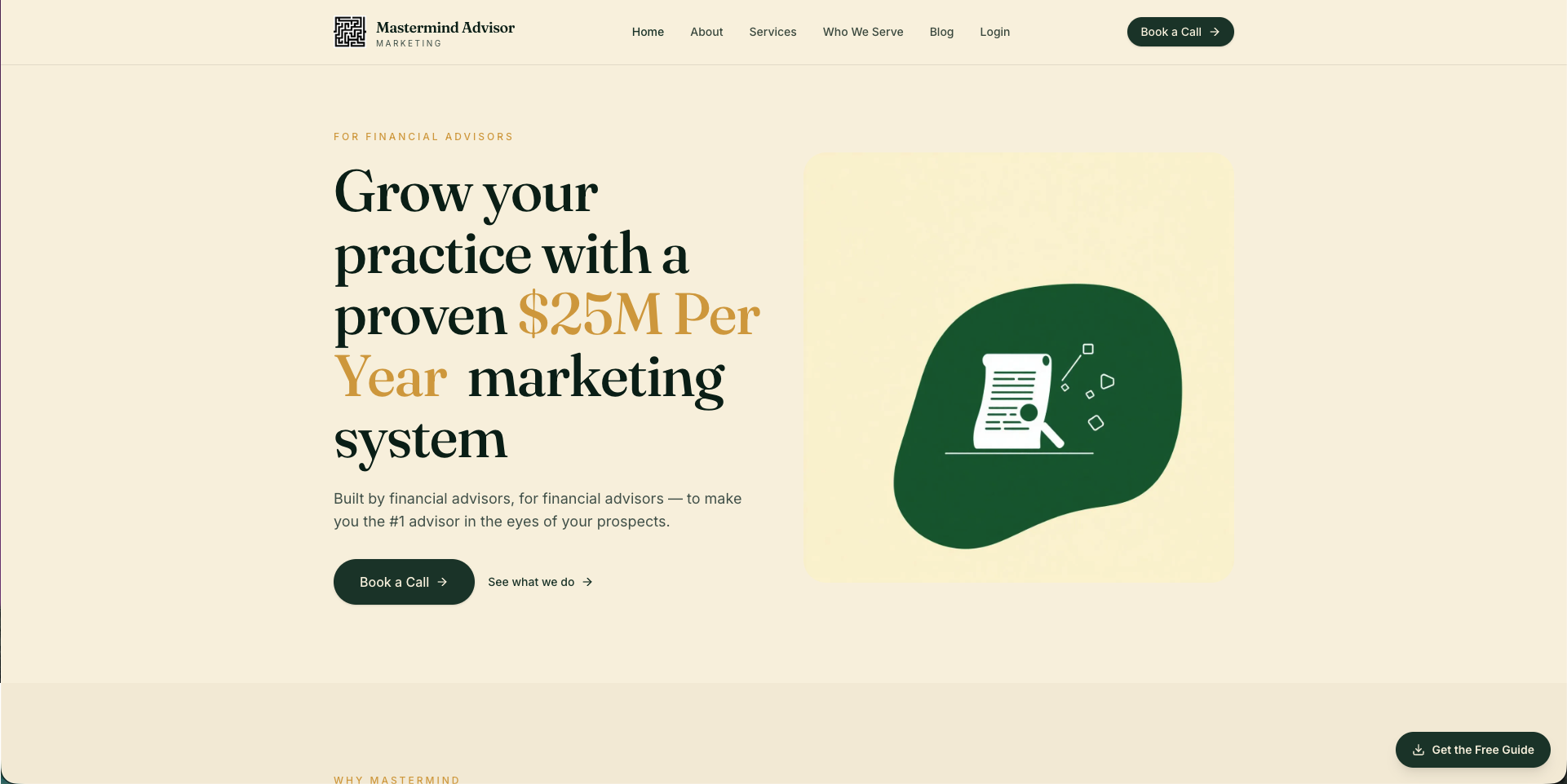
If your firm would rather implement all of this without pulling an advisor off client work to manage a testing calendar, Mastermind Advisor Marketing's core services cover high-converting websites, landing pages, and the webinars and email automation that feed them, all built specifically for the regulatory realities and long buying cycles of financial services. Firms running their own in-house marketing function well when they have dedicated staff and a compliance review process already in place; firms without that bandwidth typically see faster results handing the build and testing cadence to a team that does this daily. Explore the growth strategy approach behind the system, then reach out to map which fixes would move your numbers fastest.
Sources
- Wealth Management Industry Marketing Benchmarks 2026
- Wealth Management Landing Page Stats (2026) | Web Tonic™
- Why financial advisor website conversion stalls — TYPZA
- The Psychology Behind Your CTA: Why Prospects Don’t Click “Book a Call”
- Financial Advisor SEO: 2026 Benchmarks from 41 Advisory Firms
FAQ
What Is a Good Conversion Rate for an Advisor Website?
A solid benchmark is 3.4% for the average wealth management landing page, with top performers reaching around 11.5%. If your site sits below 3%, hero messaging and CTA friction are the most likely culprits to check first.
Should Advisors Use "Book a Call" or Softer CTA Language?
Softer language tends to perform better because it lowers the perceived commitment. Phrases like "Start a Conversation" paired with an expectation line such as "no pressure, no preparation required" reduce booking anxiety and improve both clicks and attendance.
How Short Should an Advisor Intake Form Be?
Three fields, name, email, and phone, is the sweet spot for initial contact forms. Short forms convert roughly 40% better than long forms that ask for income or asset details up front; collect that information later through a follow-up sequence instead.
Can Financial Advisors Legally Use Client Testimonials on Their Website?
Yes, under the SEC Marketing Rule, testimonials are permitted with proper disclosure of compensation and the relationship between the advisor and the person quoted. Work with your compliance team to review wording before publishing, since claims that sound like a guarantee of results typically won't clear review.
Does Mastermind Advisor Marketing Build Advisor Websites?
Yes, website design is one of Mastermind Advisor Marketing's core services, built alongside webinars, email automation, and content specifically for independent financial advisors. Pricing is available by request rather than published, since builds are scoped to each firm's needs.